Sukoon
Brand design2026Identity, packaging, character, art direction5 photographsSukoon’s useless function is two minutes of nothing. A matcha that sells stillness had to do very little, very carefully. Sukoon is Arabic for stillness, and a ceremonial matcha from Uji, Japan. Most matcha sells energy; this one sells the two quiet minutes it takes to whisk a bowl. So the identity does very little, very carefully: one green, warm paper, brushed steel, and a small figure that has already closed its eyes. 
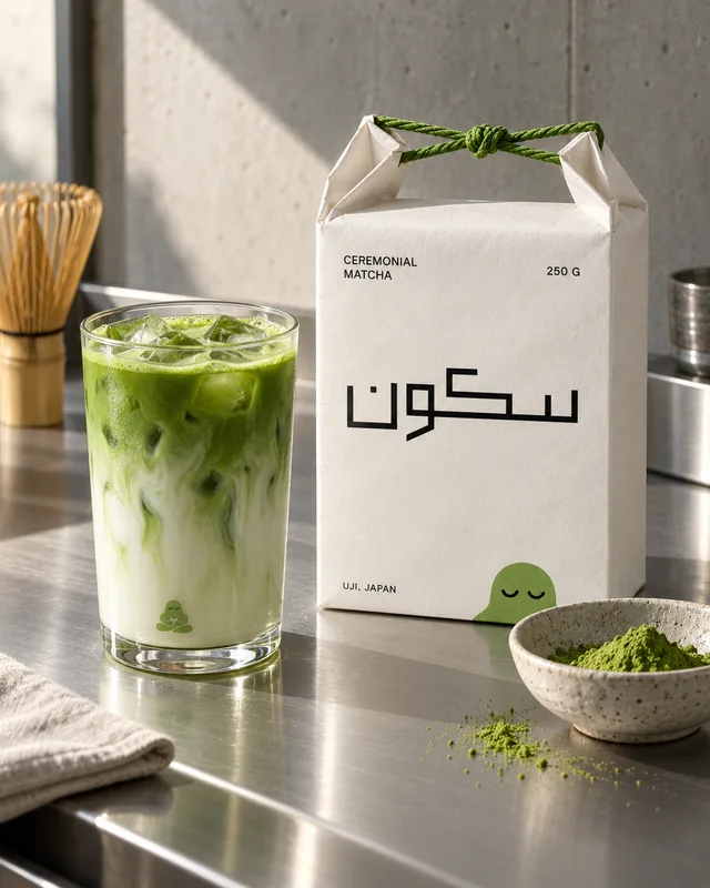
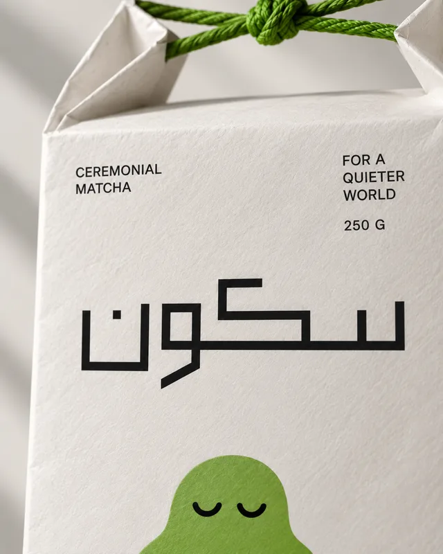
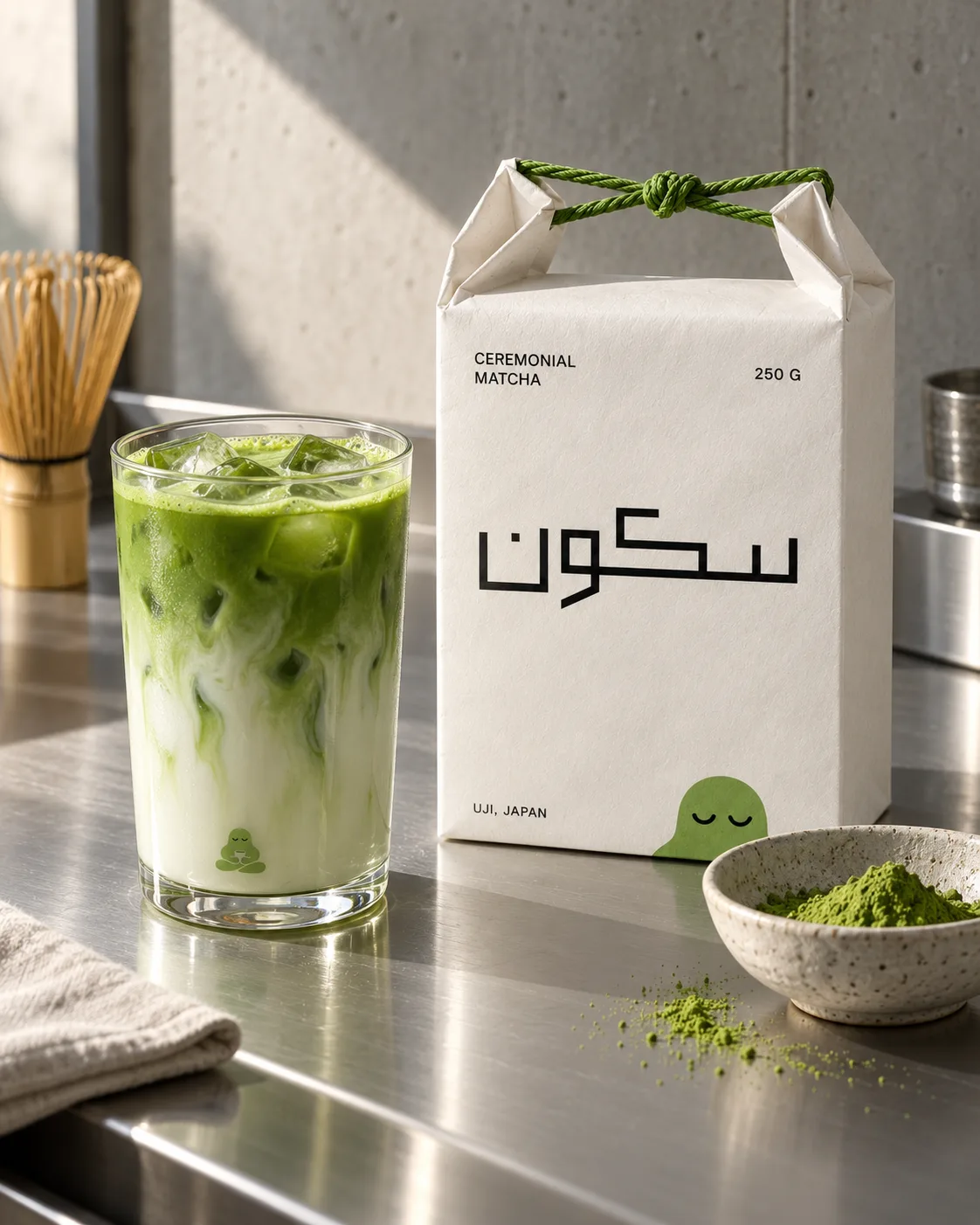
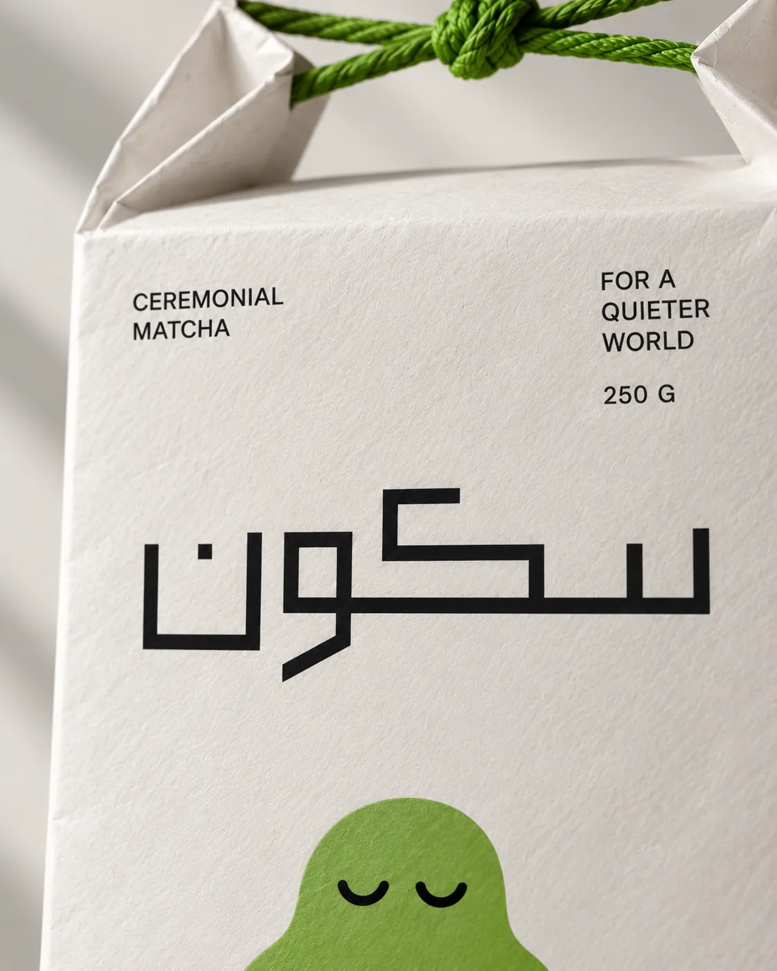
The 250 g bag and the iced latte. The wordmark is Arabic, drawn as one continuous line, and never translated. 
The bag, closed with a knot of green rope you have to untie. Green appears exactly twice: the figure and the rope. 
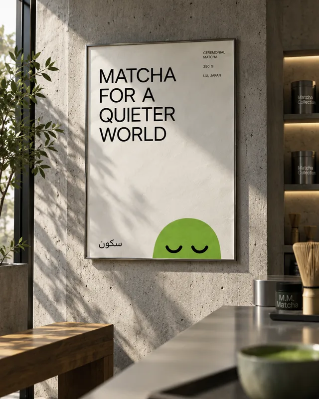
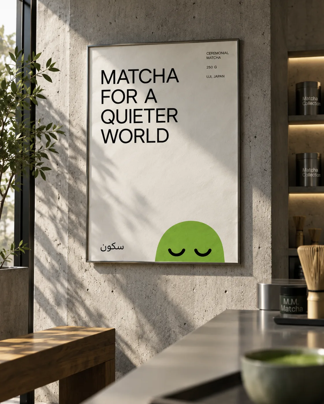
Posters: one sentence each in letter-spaced capitals, the figure peeking over the edge. Matcha for a quieter world. 
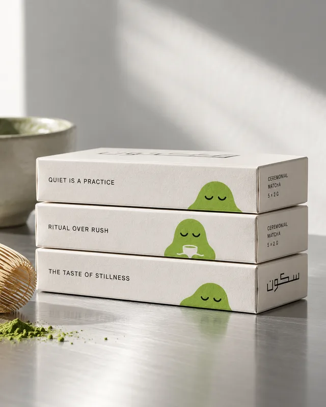
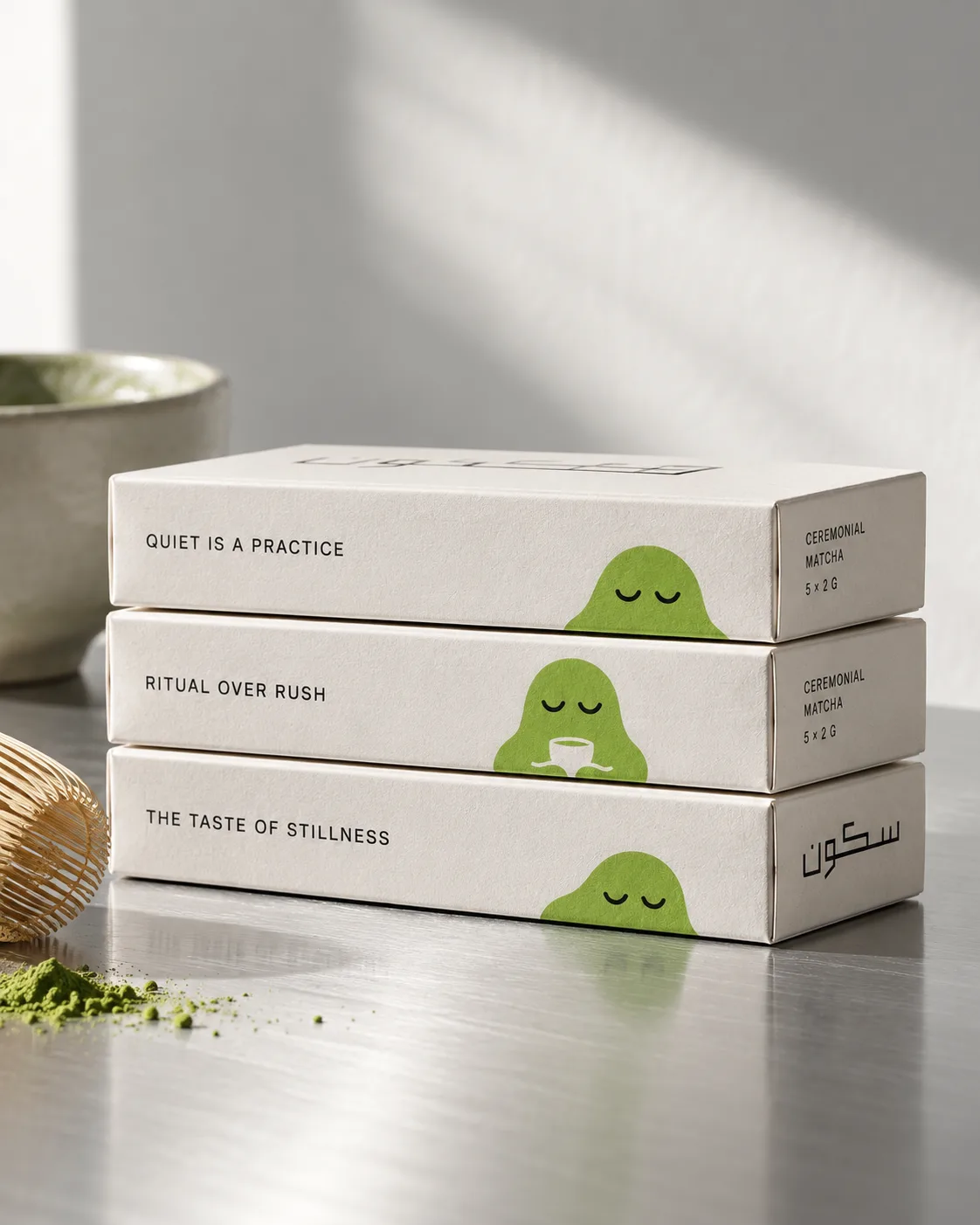
Boxes of five 2 g sachets. Quiet is a practice. Ritual over rush. The taste of stillness. 
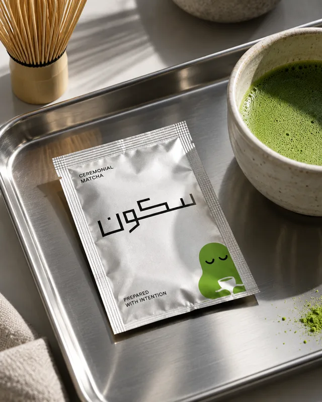
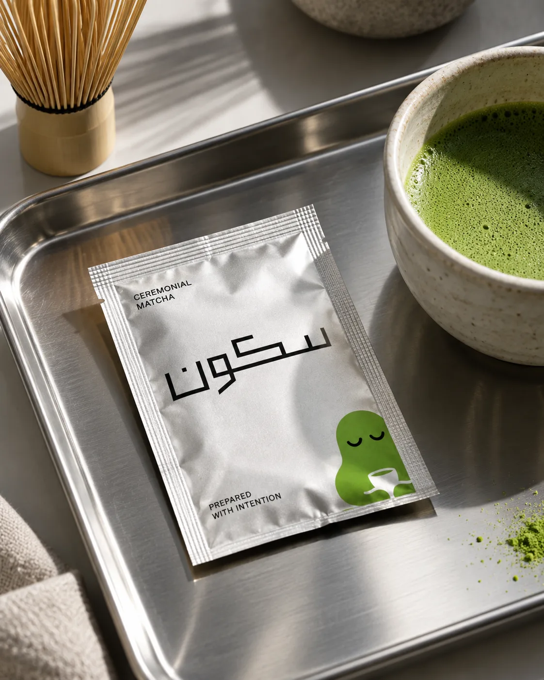
The sachet, in plain silver foil so the powder stays bright. The most-handled surface carries the most words.