Cream of Life
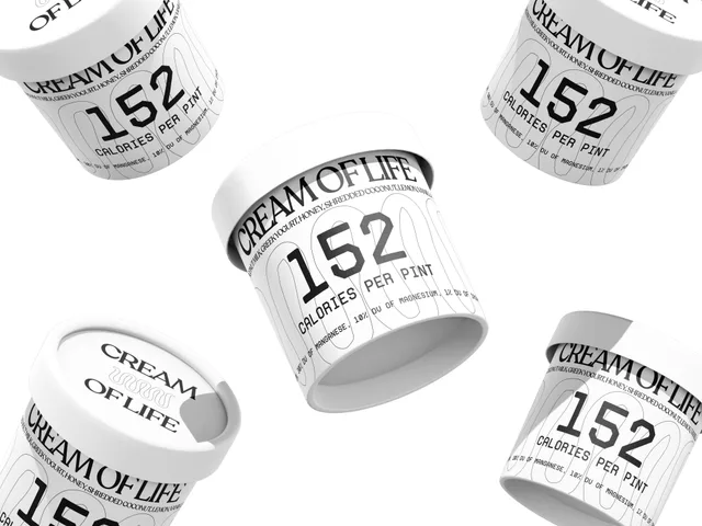
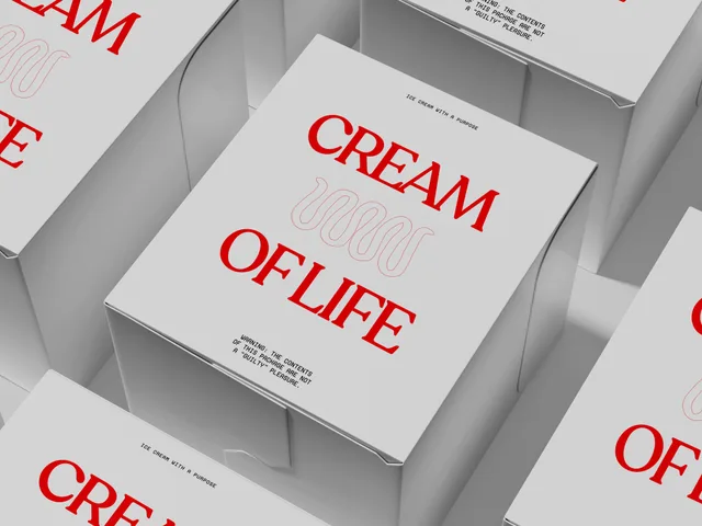
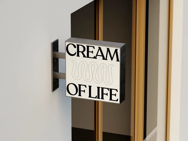
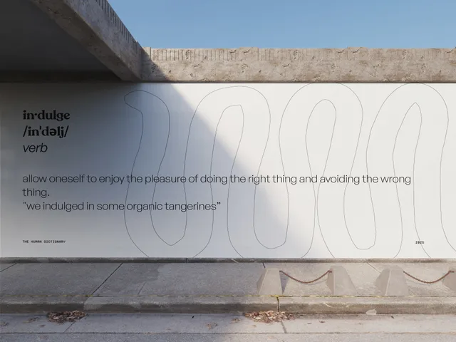
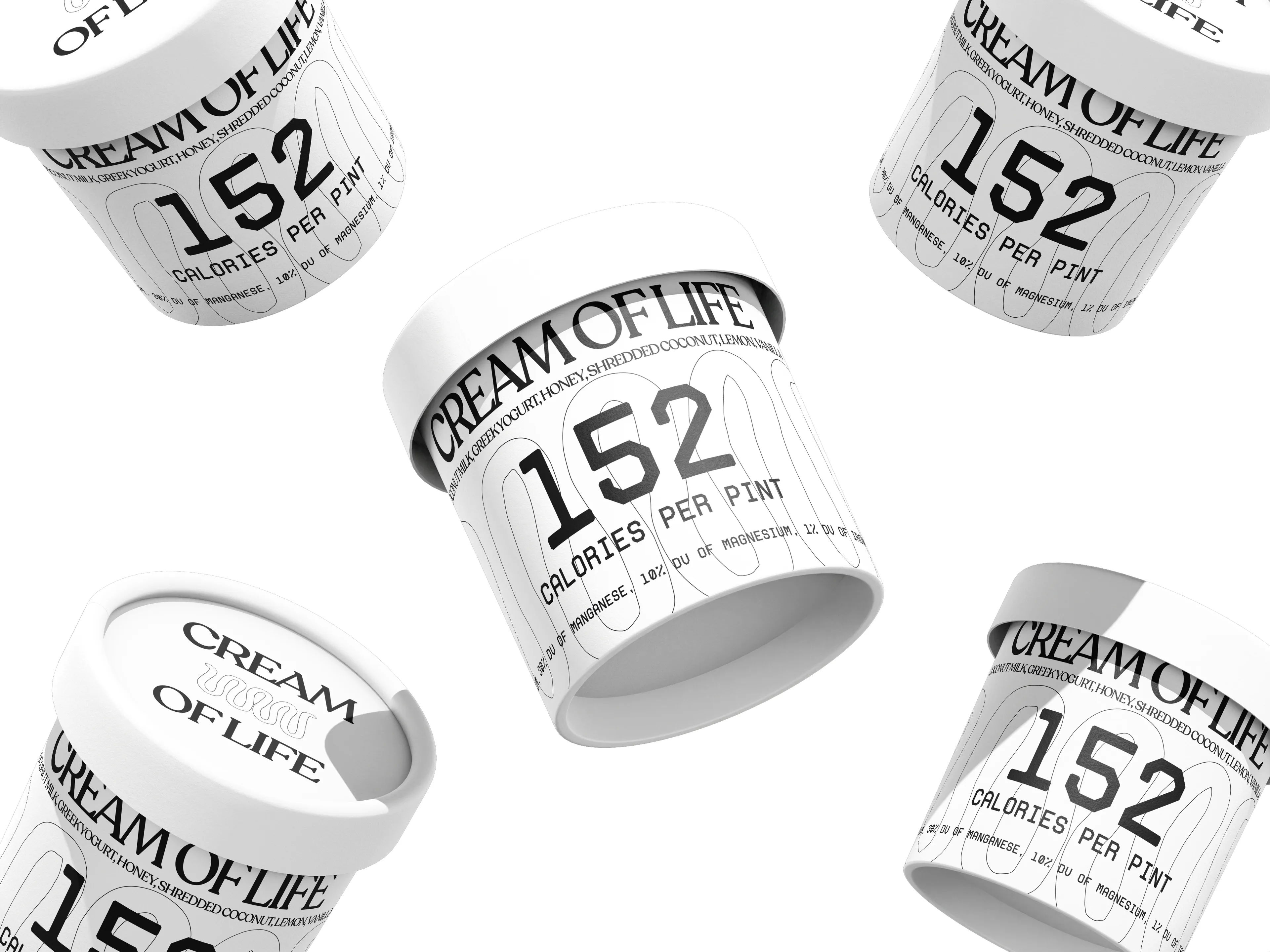
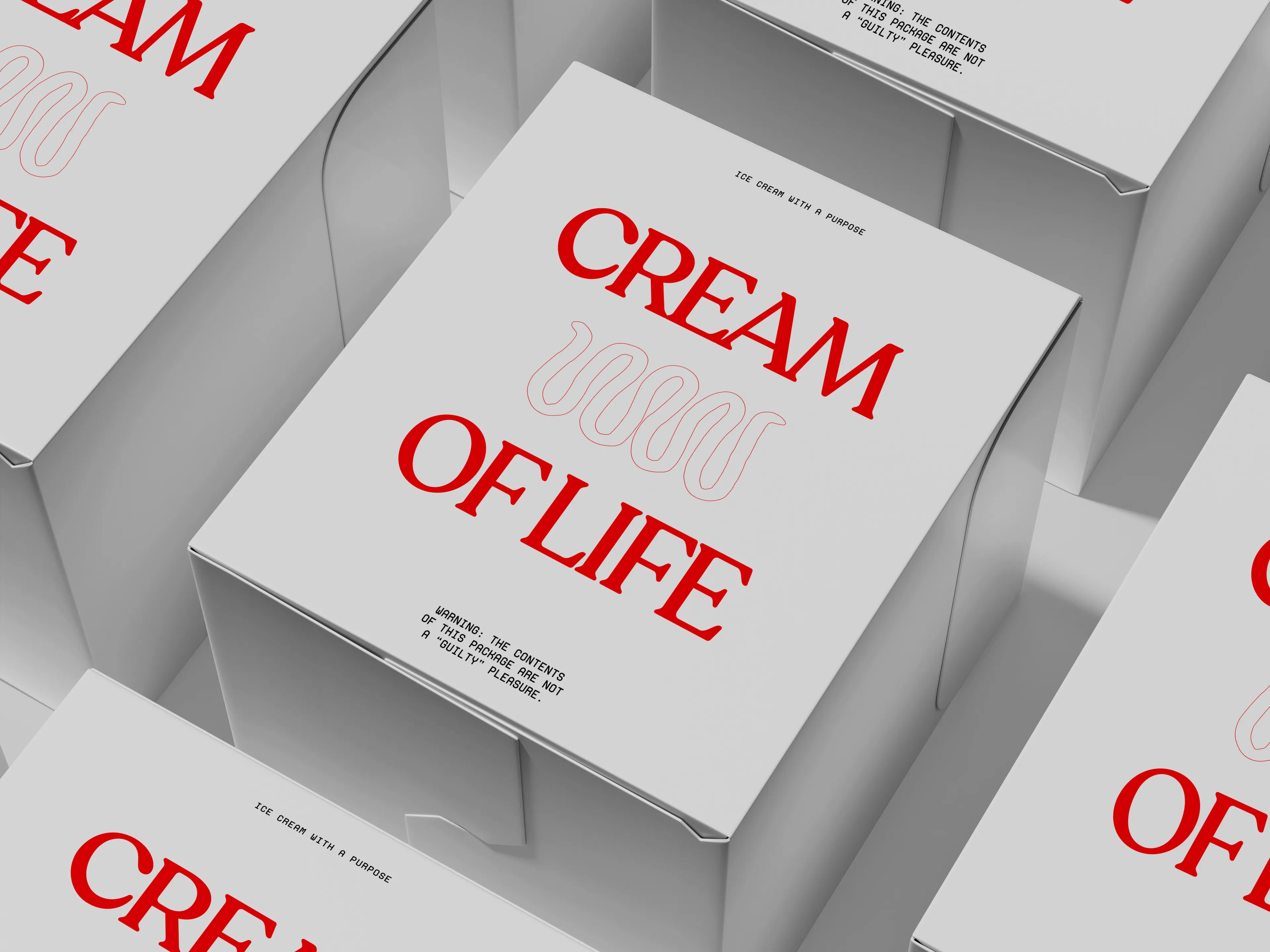
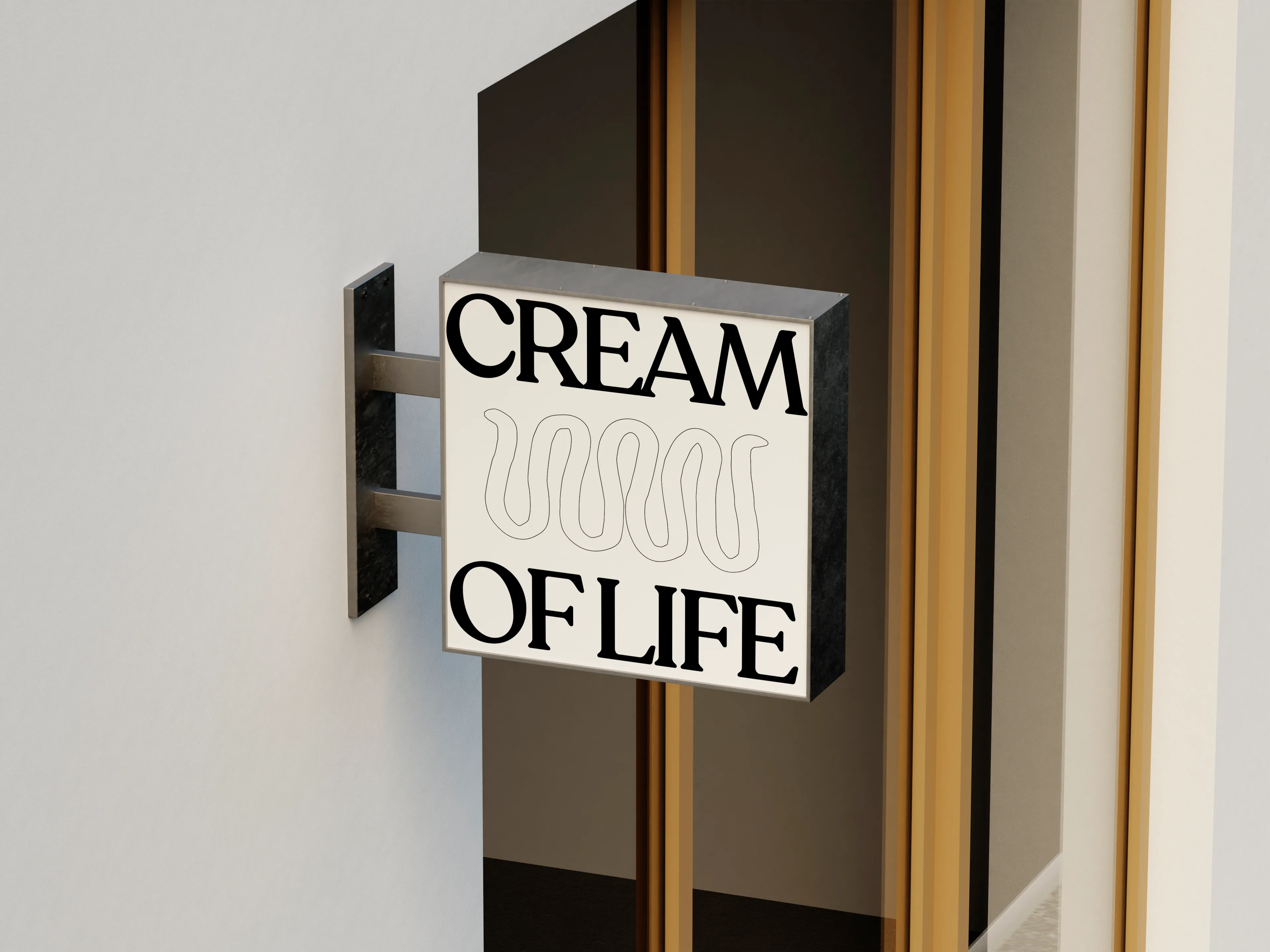
Brand design2026Identity, packaging, campaign4 photographsCream of Life’s useless function is the calories, printed large enough to read from the freezer door. Honesty, worn as decoration. Ice cream with a purpose: almond milk, Greek yogurt, real fruit, no added sugar. The category hides the label. Cream of Life puts the honest part on the front, with the calories in a numeral you can read from the freezer door and one line that wobbles.