Burgman
Brand design2026Identity, packaging, voice, photography direction5 photographsBurgman’s useless function is a cape on a cow. It sells no burgers, and it is the reason you remember the burgers. A burger joint whose spokesperson is a real cow in a red cape. Drawn letters, one red that behaves like a uniform, and packaging treated as advertising: the everyday burger taken very seriously, by a brand that does not take itself seriously at all. 
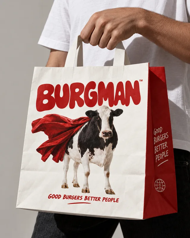
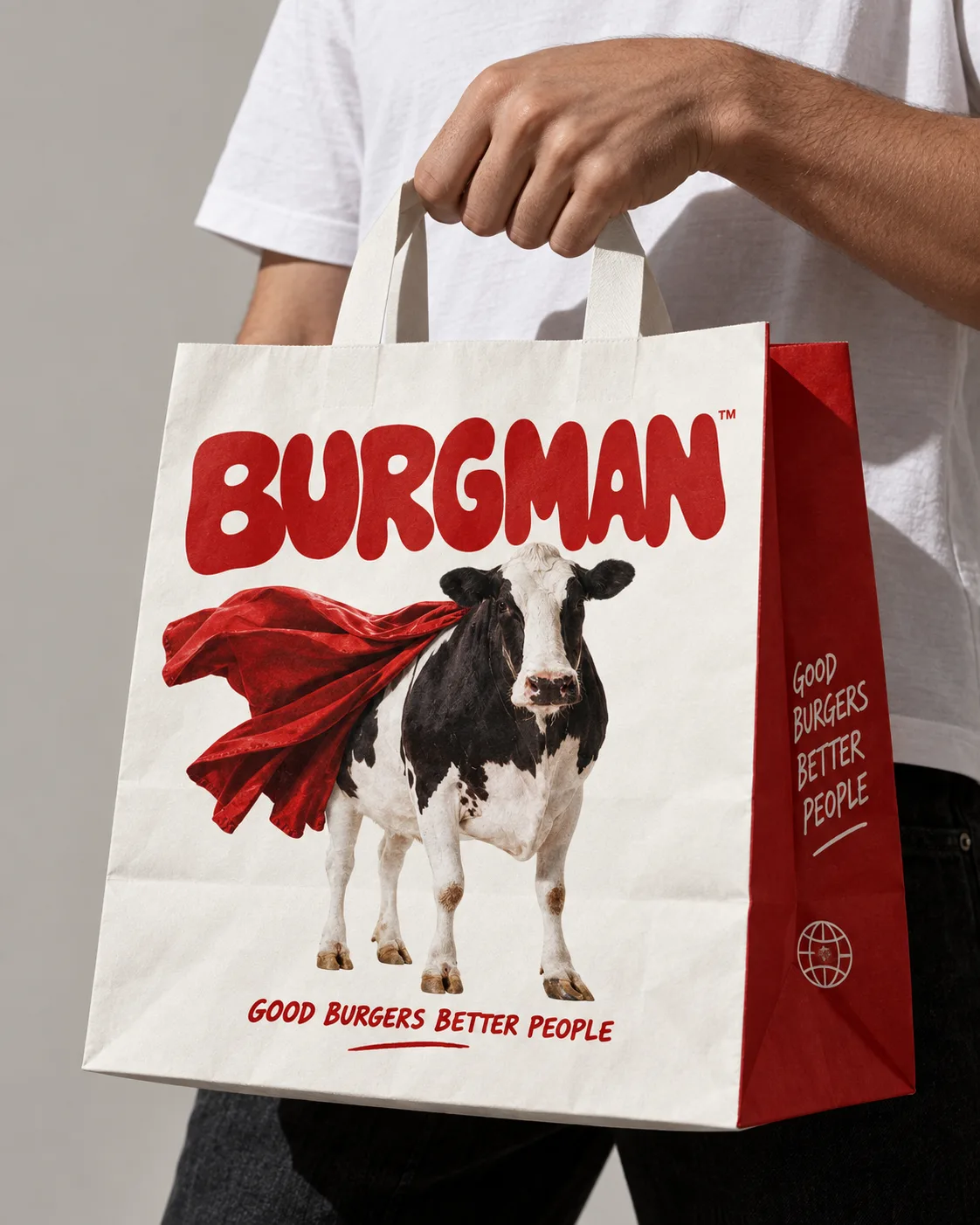
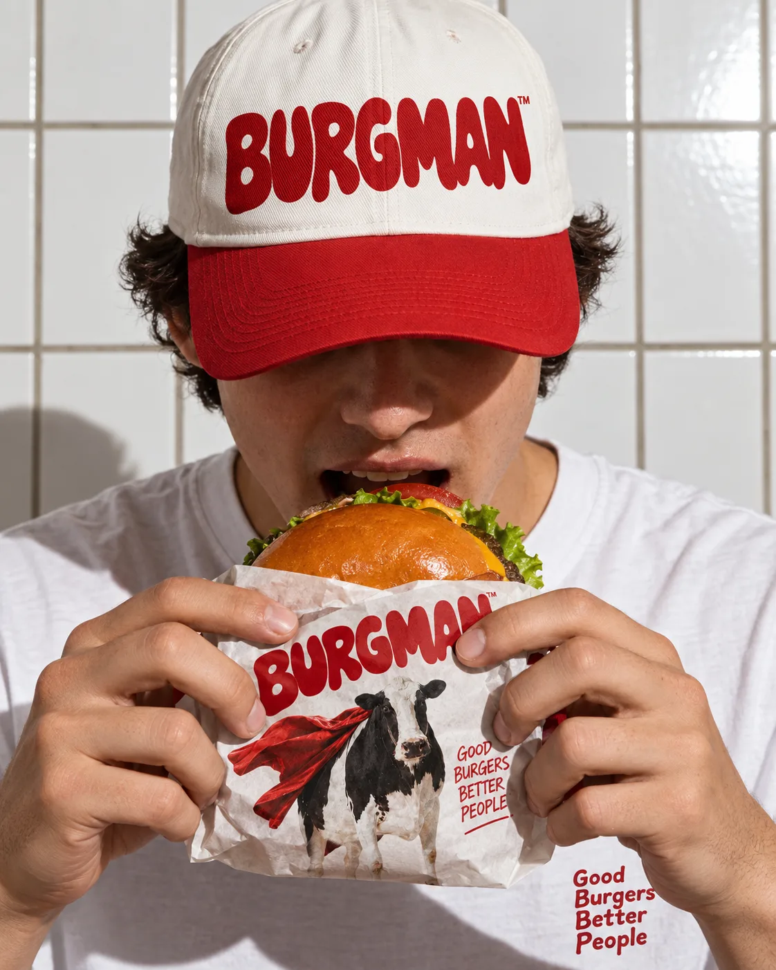
The bag. Burgman is a character, not a restaurant name: someone you call when dinner needs saving. 
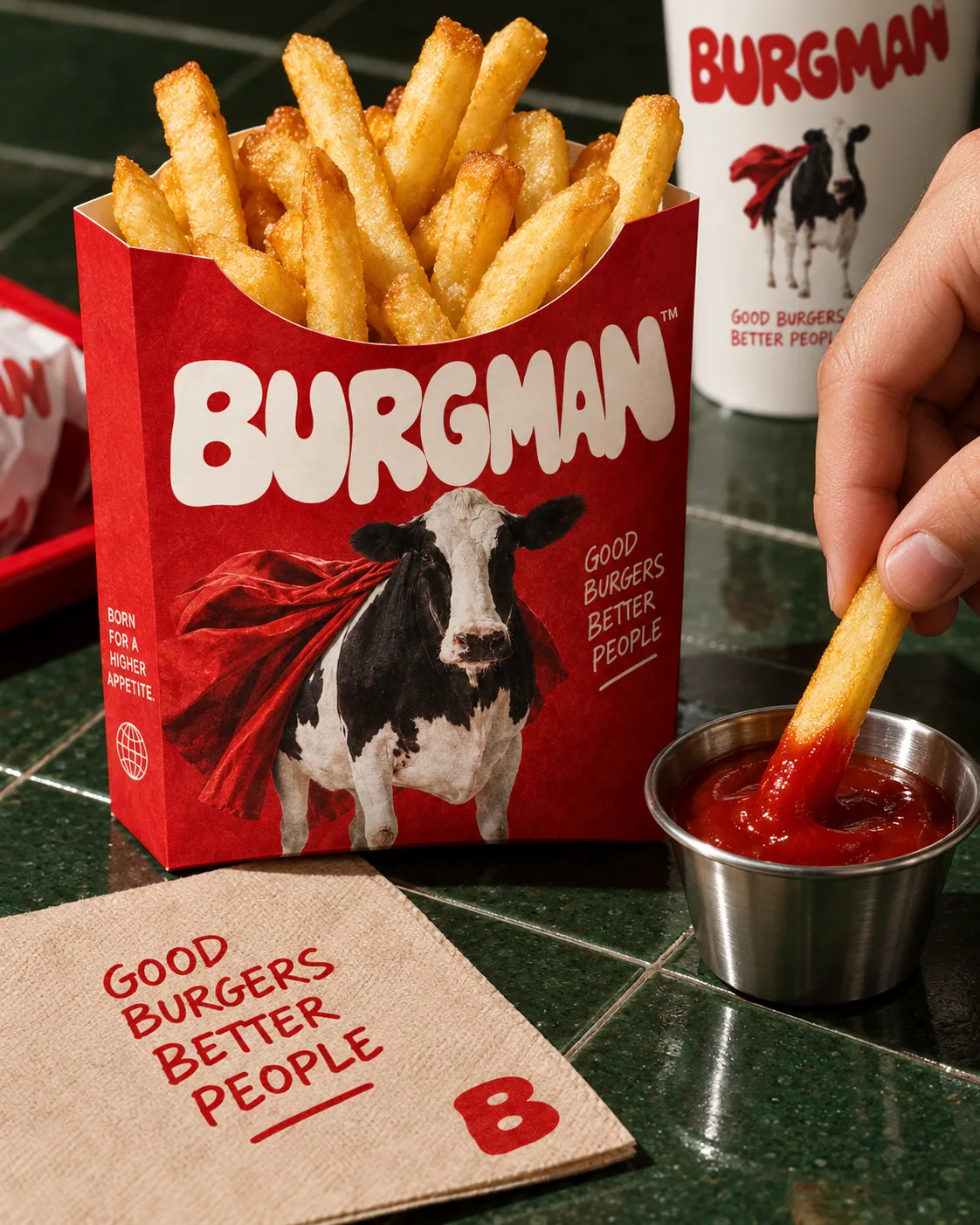
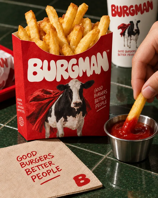
The fry carton has six seconds to make someone across the table want fries. 
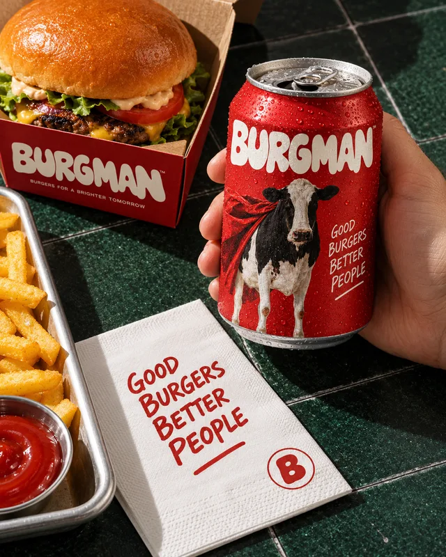
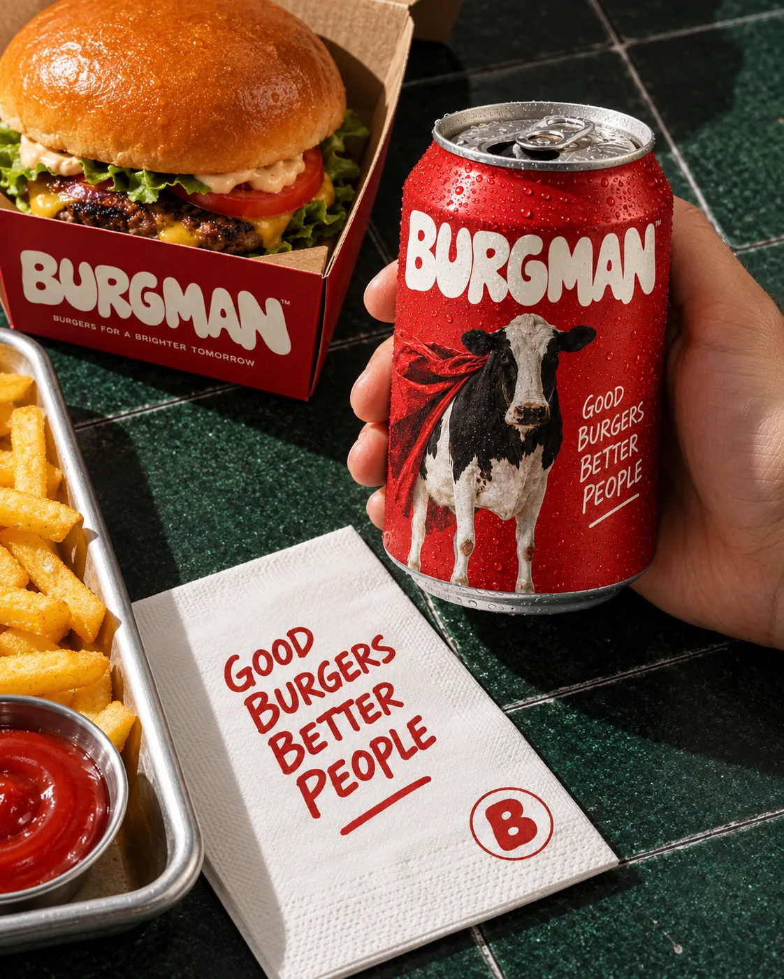
The can and the napkin. Hand-lettered proclamations carry the small print. 
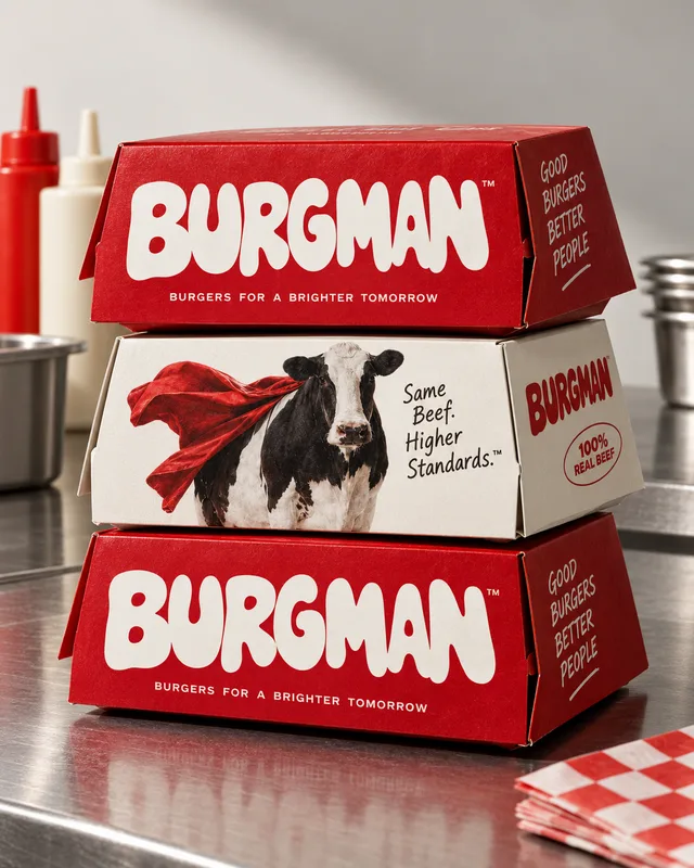
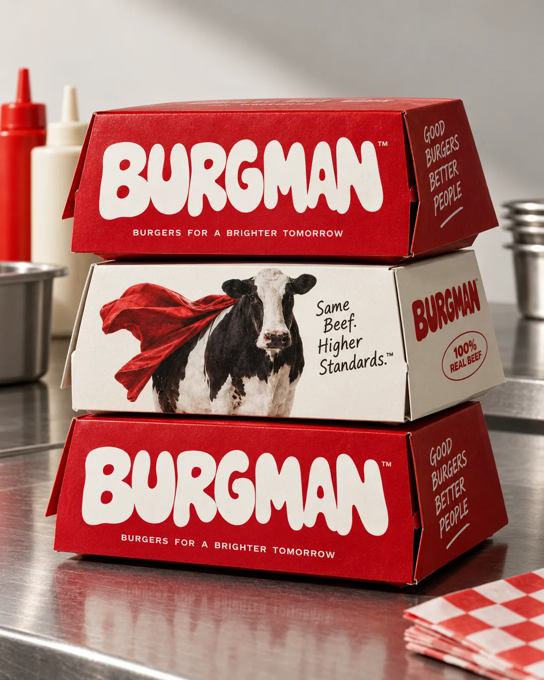
The box. Letters drawn, not typeset: squeezed, spread and sauced into place. Eat the burger, keep the box. 
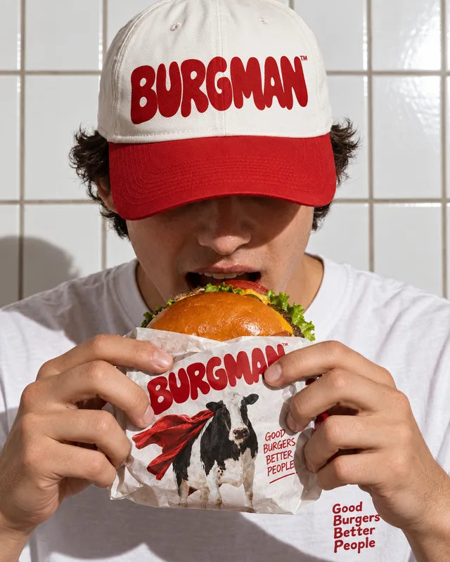
Caps, stickers, tees: an identity designed to escape the restaurant. Real people, hard flash, food close enough to touch.